The second week of the month is always the slowest one for economics statistics. So there's hardly anything else to get in the way of moving straight to the main story of the Consumer Price Index and how it is likely being mismeasured in ways that have profound implications for everything, as I teased a bit last week.
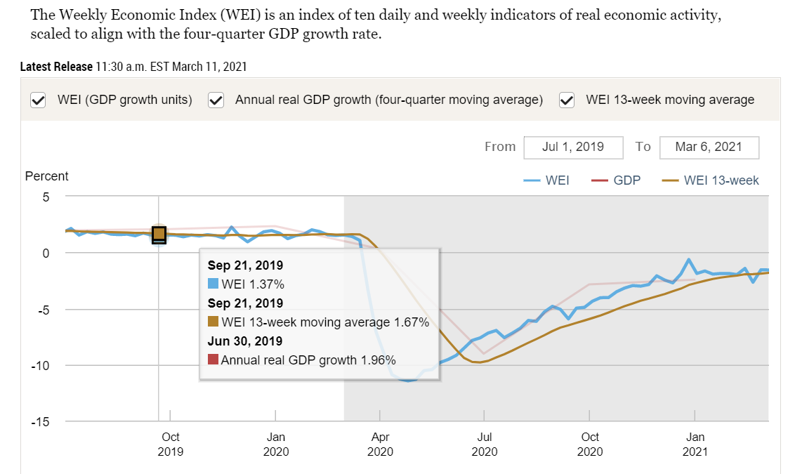
The week was so slow that it generated no updates since Mar 8 to the Federal Reserve Bank of Atlanta's GDPNow nowcast, which I discussed last week and a lot of recent weeks. It has been a while since I've gone back to the New York Fed's helpful gauge of high-frequency indicators they call the Weekly Economic Index (WEI).
The blue line shows steady improvement (with 3 little setbacks) from the end of April through Christmas, at which point the full size of the economy was only 0.64% below its year-earlier level—which looks like virtually a full recovery. Well, not quite. Consider the fact that we would have hoped/expected a normal economy to grow 2.0-2.5%+ over a year, so add that much to the shortfall to find that we were almost 3% below par. That compares to being 11.45 + 2.0-2.5 = almost 14% below par in late April. So we had recovered about 11/14 or let's say 75-80% of the COVID catastrophe over the course of those 8 months. In the 2.5 months since Christmas, though, according to this mix of 10 indicators, we've made less than zero new progress.
Here is the one paragraph of Commentary provided by the NY Fed:
The decline in the WEI for the week of March 6 is due to an increase in initial unemployment insurance claims (relative to the same time last year), which more than offset rises in tax withholding, fuel sales, rail traffic, and electricity output (relative to the same time last year).
Five of the 10 indicators are mentioned there. The other five are:
continuing unemployment insurance claims
Redbook same-store sales
Rasmussen Consumer Index
The American Staffing Association Staffing Index
raw steel production
What I really wish is that I could see all ten of them arrayed against each other for the whole year, so we could really tell what they show beyond the volatile week-to-week fluctuations. Alas, I haven't found a convenient place for that. Maybe one of these weekends I'll spend a big block of time tracking down all ten to create and present the array I imagine. (However, the 1040 tax form will occupy one or more of the next weekends, possibly blocking one upcoming week's newsletter, so I'm not scheduling this idea in the immediate future.)
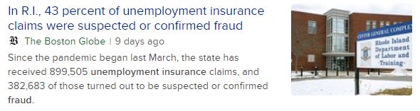
Another consideration is the wholesale fraud going on with the unemployment insurance system. That would seem to make two of the 10 components of the WEI—initial claims and continuing claims—massively out of whack. It's a huge scandal that should be receiving a lot more national press. (I did see that NBC Nightly News did a significant story on it one day in February.) When I do hear about it, the news is that there are more fraudulent claims than genuine ones, which seems incredible, but that's what I hear even on our 'responsible' state media organs. Here's one interesting part of what turned up in a 3-second search:
A little short of a majority in Rhode Island, but I swear I heard the "more cases fraudulent than not" stat for one state or another somewhere recently, probably on NPR. Here's the top story at this moment in a local news outlet from Maryland; it looks pretty informative: "Unemployment Mess—The Real Story"
I'd really like to know how the NY Fed accounts or adjusts for the necessarily large asterisks in these two of its ten Weekly Economic Index indicators, and whether or how much the fraud is distorting the blue line we see graphed above.
I saw a Biden economist on the PBS NewsHour Monday night struggling to explain why it's necessary to pour inflationary spending fuel onto an economy that is ready to fully ignite. All of which is in keeping with my whole point in last week's newsletter.
On to the main topic of measurement problems distorting our inflation statistics. At this point I really recommend following this link to read the full 2500-word essay penned by investment analyst John Mauldin. It's called "Inflation is Broken" (March 12, 2021) and it forms the basis for most of the rest of my newsletter this week. It serves as something of a follow-up to his March 5 essay "Everything is Broken," but each of them stands on its own.
First, the stakes. If inflation is being mismeasured,
This affects everything. If Federal Reserve officials think inflation is low when it’s actually high, or vice versa, they will set interest rates too high or low. Governments, businesses, and consumers will all make similarly bad decisions, all of which will eventually coalesce into a catastrophe like the Great Recession. And it will all trace back to a data problem. (bold emphasis added; italic in original)
Mauldin's main point is that housing forms a large share of the 'market basket' of goods and services that make up the Consumer Price Index (CPI) or any other measure of price inflation, and that the way they come up with the housing price number is systematically inaccurate. First, what share does or should housing form within the market basket? I don't know about 'should,' and neither does anyone else with any certainty. New home purchasers who have both huge mortgages and small, not-yet-full-earning-adult incomes will pay a huge share of their budgets on housing; so will poor people with proportionally high rents. And other young adults who live cost-free or nearly so in other people's homes (like their parents) plus older people who have succeeded in paying off their mortgages will pay close to nothing per month for housing. But the national CPI market basket has to use one weighting number for everybody, some sort of weighted average of all of the above.
The same matter of weighting comes into play for every category, many of which have huge divergences from person to person. If college tuition (plus associated books, fees, etc.) is part of your budget, it's probably a huge part of your budget. And it will be for maybe 2 years, maybe 10+ years, and then it will stop. (Servicing of debt is a different matter.) Given that about half of people ever go to college at all—and that a very large number of people who go, don't go for long before dropping out—I'm going to roughly estimate that college costs matter to the mythical 'average person' for about 3 years out of every 80-year or 90-year lifespan. (I believe that the lifespans of young people alive now will be increasing quickly, such that today's age 80 will be equivalent to tomorrow's 90 by the time those people reach that age.) So that's 3 years of super-high tuition expenses and 80-some years of zero tuition expenses that must be weighted together into one number representing the share of tuition in everyone's 'average' market basket over the lifetime.
In all of the above, I'm just pointing out the difficulty and near absurdity of measuring "cost of living" for everybody, when people have different spending profiles across all sorts of circumstances, and even across the lifespan of an individual. Yet making some massive, heroic assumptions along these lines are necessary in any attempt to measure inflation.
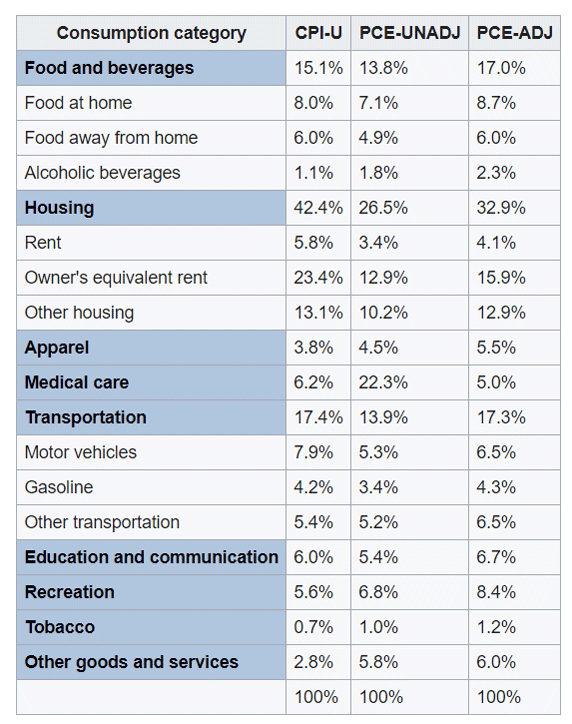
Now, there are actually at least 3 measures of inflation to consider—the Labor Department's CPI and two measures from the Commerce Department's index of Personal Consumption Expenditures (PCE). Take a look at the weightings of all 3, courtesy of Mauldin, by way of Wikipedia, by way of the source agencies; pay attention to differences across the columns.
See the weights for housing? We can't even come within broad-side-of-a-barn range of being close to agreement. Is it about 26% of the household budget? Or about 42%? Or anywhere in between? Even that right there is enough to call into major question the meaningfulness of the resulting inflation numbers. If changes in housing costs diverge much from the prices of other things, it matters very much whether we weight housing at 26% or 42%. And that's before Mauldin even gets to his main point, which is how to measure housing costs at all.
His section "Housing vs. Shelter" explains a topic I've partially known and partially forgotten since my time as a research macroeconomist over 30 years ago. It concerns a concept I used to know as "imputed rental value" and which he and the government now call "owner's equivalent rent" (OER).
So where do the benchmarks get that OER number? They do a monthly phone survey. Respondents are asked if they own or rent their home. Renters state how much they pay. Easy enough. Homeowners are asked what they “would” charge someone else to live in their same home, if it were empty and unfurnished.
See a problem? This is completely subjective. Have you done the market research to see what you would charge to rent your home? Have you actually tried to rent it at that price? Probably not. So OER is uninformed guesswork from the start. …
Adjusted subjective opinions of how much rent a given residence in a given place would fetch in a given month are a huge part of our inflation measures. …
You can’t instruct people to imagine doing something that may be inconceivable to them and expect to get any kind of reliable answer.
Yet that’s how we arrive at a number that is the largest single input into (arguably) the single most important economic data point, which a committee at the Fed looks at when setting the single most important price in the world. See the problem?
By "the single most important price in the world," Mauldin is referring to the overnight interest rates controlled by the Federal Reserve. (An interest rate is a price, namely of borrowed/lent money.)
I had asserted above that "the way they come up with the housing price number is systematically inaccurate." Here's my evidence, from Mauldin:
we would already have 2% inflation, and probably more, if we correctly measured housing in the PCE and CPI with the actual cost of homeownership instead of imputing it via OER, as is done in both CPI and PCE.
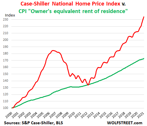
OER and housing prices … diverged because home prices took off higher when Greenspan kept rates artificially low [in 2001-2006], creating a housing bubble which led to a subprime bubble [seen in red in the chart below]. …
Actually, the Bureau of Labor Statistics released its monthly CPI report on Wed Mar 10, and it showed 1.7% inflation over the preceding 12 months.
Sidebar: before I go further, Mauldin has namedropped Alan Greenspan, Chairman of the Federal Reserve Board of Governors from 1987 to 2006. His successors, in order, have been Ben Bernanke, Janet Yellen, and Jerome Powell, all of whom are referenced below.
Here, without looking for long I found an alternative version of Mauldin's story, but providing a clearer graphic than he does. I can't vouch for certain that this source, Wolf Richter, is not some sort of crackpot, but on this topic at least he is on point: "House Price Inflation in CPI is of Course Complete Baloney, but it Accounts for 1/4 of Total CPI" He runs the same numbers as I just quoted from Mauldin and comes to a slightly different conclusion:
The “owner’s equivalent rent of residence” accounts for 24.2% of CPI. If it had increased by 10.4%, in line with the Case-Shiller index, instead of 2.0%, the overall CPI would have increased by 2.03 percentage points more. So add the 2.03 percentage points to the reported overall CPI increase of 1.7%. And the thus corrected overall CPI would have shot up by 3.7%!
It seems remarkable to me that measured from either 2000 or 2012, when the two colored measures of home prices / housing costs coincided both times, the CPI "what do you suppose you would get if you tried to rent your house" version rose by 70-some percent, while the other measure of home prices rose by 130-some percent. In about another month, the red line's increase will have fully doubled the official green CPI line's growth.
Richter is also helpful in explaining where the red home price line comes from and what it means:
The S&P Case-Shiller Home Price index is a good measure of house price inflation because it is based on the “sales pairs” method, comparing the price of a house when it was sold in the current month, to the price of the same house in prior transactions years ago. It also accounts for improvements and removes outliers. In other words, it measures how many dollars it takes to buy the same house over time – and thereby it measures house-price inflation.
Now back to Mauldin for what I think is his most powerful point and the punchline of this newsletter:
Now, imagine an alternate universe in which, ahead of the Great Recession [2007-09], the Fed had looked at inflation based on housing prices instead of implied OER. Instead of cutting [interest] rates to stimulate growth, they would have likely raised rates to fight the obvious inflation.
You can go back even further. If Greenspan had raised rates because of rising inflation starting about 2003–4, there would have been no housing bubble, no subprime crisis, no overheated stock market, and no stock market crash. We would not have had the worst unemployment numbers since the Great Depression. Retirees and everyone else would have been able to earn reasonable yields on fixed income instruments. [Double bold + italic emphasis in the original]
Earlier in his essay Mauldin had written, "I believe we have passed the point of no return." Here's one way that he elaborates on that thought: "Thanks to years of mistakes, Powell is locked into a policy trajectory that leads nowhere good but also can’t be changed without enormous pain." I already quoted the part about "will eventually coalesce into a catastrophe." He's saying "locked in" and "will"—not "might," and not "would" under some conditions that we have a chance to avoid.
As if all that is not alarming enough, here's a little more. Notice his use of 'will' again here [emphasis added to make it unmissable]:
People hail Greenspan and Bernanke as some kind of maestros who orchestrated an economic symphony. I disagree. I think their actions were the root cause of the Great Recession, just as Yellen and now Powell and his successor will cause the next crisis. Artificially low inflation benchmarks, due in large part (though not exclusively) to the housing mismeasurement, give them the justification they need to give Wall Street (and increasingly Main Street) what it wants.
That last part about Wall Street would be clearer if it read: "… give them the justification they need to keep interest rates too rock-bottom low for too long, thus exacerbating inequality, fueling more inflation that we're not measuring correctly, and eventually leading to big asset price bubbles that burst, very painfully." But I know from reading Mauldin every Friday that this is exactly what he means.
Summary: 2021 is and will be much better than the Administration wants you to think, as they play a combination of the set-low-expectations-and-exceed-them game and the you-need-my-generous-help game. We’ll experience a combination of genuine recovery from the COVID crash and sugar high from the artificially high government spending and artificially low interest rates. But both our elected government's spending policies and the Federal Reserve's interest rate policies are setting us up for a hard fall in some year to come.