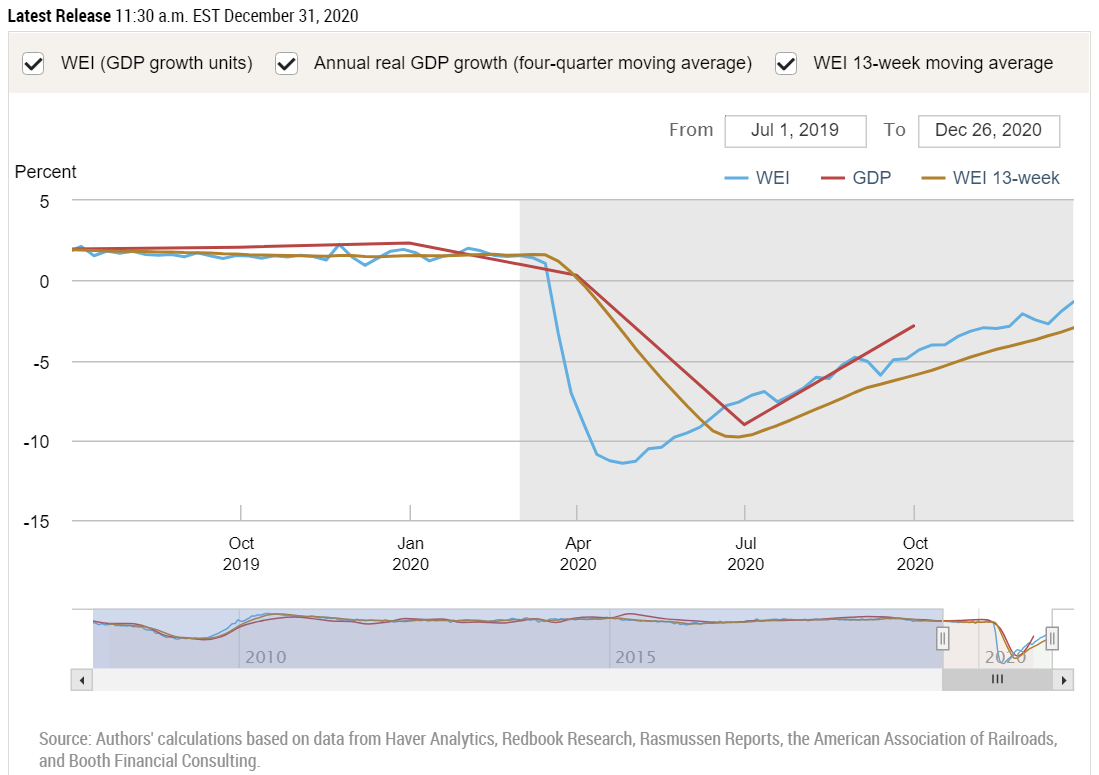
Based on what scant new information there is, the end of December looks good for the economy's recovery. New info was insufficient to prompt any new output from the GDPNow now-cast from the Federal Reserve Bank of Atlanta; we will get one or two updates next week. But the NY Branch of the Fed came through with their regular Weekly Economic Index. Incorporating data from Dec 20-26, the index rose to -1.32 from -1.97 the week before. The number indicates the percentage that aggregate economic activity differs from one year ago.
You can see in the graph that in the ordinary, prosperous times before March 2020 we were consistently growing at around 2% annually; by the end of April we were -11.45% below 04/19, and we've been recovering ever since. After two weeks of setback in early Dec, the subsequent two weeks have been strong. Of the 10 specific pieces that make up the composite index, the NY Fed names five of them as having contributed more than the others to the latest week's healthy outcome:
The increase in the WEI for the week of December 26 is due to a decrease in initial unemployment insurance claims, an increase in tax withholding, and rises in fuel sales, electricity output, and rail traffic (relative to the same time last year).
There is further good news buried in the detail: the second-to-last reading of -1.97 is an upward revision from the -2.21 that I reported last week for that point. We are getting tantalizingly close to being back to par with year-ago numbers.
On Dec 28 and 29 the Federal Reserve Bank of Dallas released a trio of surveys of activity w/r/t the manufacturing, services, and energy sectors in Texas. It's only one state, but the news is good across the board. Manufacturing output not only rose but accelerated in December. The same was true of new orders and broader business conditions, according to the survey. About the all-important jobs picture, the Texas manufacturing survey said:
Labor market measures indicated an increase in employment and work hours. The employment index increased from 11.7 to 19.6, suggesting a pickup in hiring. Thirty percent of firms noted net hiring, while 10 percent noted net layoffs.
About the much larger services sector, the Dallas Fed tells us:
The revenue index, a key measure of state service sector conditions, rose from -0.7 in November to 4.2 in December, indicating a modest increase in activity.
Labor market indicators point to an increase in employment and hours worked.
The employment index rose over four points to 5.1, while the part-time employment index advanced from -0.4 to 1.7.
Perceptions of broader business conditions remained subdued in December. The general business activity index continued to weaken, declining from -2.6 to -4.3. However, the company outlook index ticked up to positive territory, increasing from -0.8 to 0.7. The outlook uncertainty index remained positive but fell over 12 points to 5.2.
Respondents’ expectations regarding future business activity reflected increased optimism compared with November.
And about energy, the Q4 news from Texas is even more clearly positive:
Activity in the oil and gas sector jumped in fourth quarter 2020, according to oil and gas executives responding to the Dallas Fed Energy Survey. The business activity index—the survey’s broadest measure of conditions facing Eleventh District energy firms—moved into positive territory, rising from -6.6 in the third quarter to 18.5 in the fourth quarter. This is the first positive reading for the business activity index since first quarter 2019, with the increase driven by both E&P [exploration and production] and oilfield services firms.
On a radio news update I heard of an forecast from the investment bank Morgan Stanley. I looked it up, and found it's a global economic outlook. The point of the radio headline was Morgan Stanley's optimism, and this is indeed reflected in their report. Here is the paragraph bearing on the United States:
The U.S. economy, for its part, has stayed resilient through the pandemic. Consumer spending has nearly returned to pre-COVID-19 levels, while average personal incomes of U.S. households surpassed prepandemic levels in September, even after the first round of fiscal support expired. These and other factors suggest a sustainable U.S. recovery, even amid a difficult winter, with projected GDP growth of 5.9% in 2021.
Morgan Stanley simultaneously released a 15-minute podcast explaining their forecast. The emphasis there is that Morgan Stanley is more optimistic than are many other forecasters. Globally, they are calling for 6.4% growth in 2021, about one percentage point higher than the consensus. I report on Morgan Stanley not because they are an outlier but because I have easy access to their numbers and their thinking.
They believe the recovery will really accelerate around March or April, which seems to hinge on their view of the virus and vaccines. They are also somewhat outliers in calling for an acceleration of inflation, and I mean to write some time soon about why I agree with that.
I agree with this market strategist Michael Antonelli and others I have quoted recently. Referring to pent-up demand, he says, "My resolution for next year is to get out of my home, and I think a lot of Americans will feel that same way. … I believe next year is shaping up to be really, really underestimated in terms of its growth."
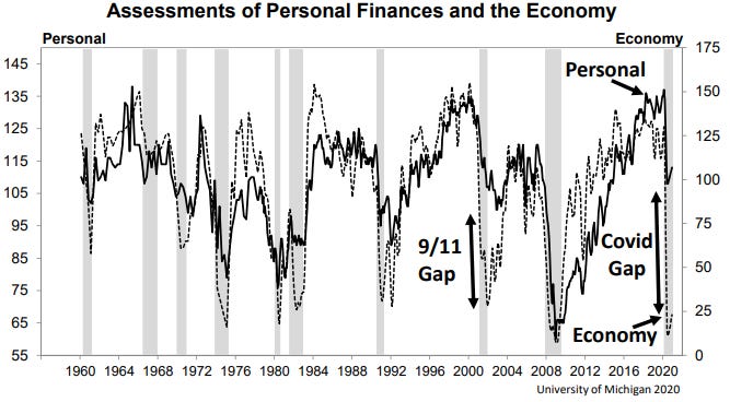
With space to fill for this week, I return to a point I made in the second half of last week's newsletter. Refreshing your memory, I presented the following graph and commentary:
The graph-makers at UMich see a large and unusual divergence between people's own experience and what they think they know about others' experiences and call it the "Covid Gap" of 2020. I believe the correct explanation for this is the one I already hinted at: People are the world's foremost authorities with perfect information about their own personal finances, while they are relying on second-hand hearsay for their impressions of remote concepts like the national average of the economy. And from where do we get this second-hand hearsay? It must be the case that the news media have been telling a much gloomier story than what is true of people's "lived experiences."
The graph above might as well be re-labeled to have the solid line tagged as "lived experience" and the dotted line tagged as "media spin."
My purpose in reprinting this is to call attention to an idea that I like pointing out whenever I come across it. It seems to be easy for others to miss, but to me it stands out: when one random-sample survey asks people how they are themselves doing financially and also asks how they think everybody else is doing, the answers should have at the very least the same medians, if not the same statistical distributions all the way around. If people answer more optimistically about themselves than they do about others, then it is their pessimistic perception of others' status that is skewed. And that usually seems to be the case.
Here is an excerpt from the other major time that I wrote about this dynamic. It was in a Facebook "Note"—a feature discontinued by the Zucks as of Halloween 2020, to the distress of many—that I published on 10/26/2019 regarding the famous "40% can't afford a $400 surprise expense" meme that everybody keeps talking about. I tracked down the origin the meme: the Federal Reserve's annual Report on the Economic Well-Being of U.S. Households, and specifically its Appendix B. I wrote:
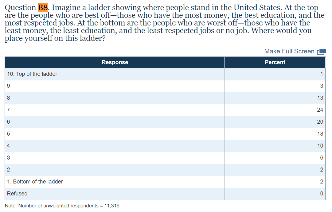
The survey continues with Question B8, a really fascinating one: “Imagine a ladder showing where people stand in the United States. At the top are the people who are best off—those who have the most money, the best education, and the most respected jobs. At the bottom are the people who are worst off—those who have the least money, the least education, and the least respected jobs or no job. Where would you place yourself on this ladder?” …
Since people already know, first hand, everything there is to know about their own financial situation, for a survey to ask this ranking question is really to ask what people believe (but don't know) about everybody else's financial situation. And the fact that most people place themselves above the median means that they are underestimating the median. That is, the responses to this question indicate that people believe that other people, by and large, aren't doing as well as those other people actually are.
And why do you suppose so many people are systematically underestimating the financial status of others? Do you suppose it might be because we are constantly being exposed to information—dare I say 'fake news'?—that leads us to believe that the economy sucks . . . for everybody else, even though we know in most of our own first-hand lives that we're doing at least OK?
The more I look at the data in the survey, the more strongly I believe this is the case.
That's what I wrote in October 2019 regarding data published by the Fed in May '19 from a survey conducted in October ‘18. Here is an image of the data showing a median 'ladder' score between '6' and '7':
The same survey was conducted one year later, and in May 2020 the results were released in the midst of the COVID catastrophe. Of course, by that time, everyone knew that the economic environment had changed, and so the Fed followed up with an April '20 re-survey. They did so again in July '20, but not again since. Unfortunately, I cannot find 2019 nor 2020 info about the 'ladder' question B8.
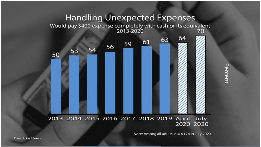
But the question that became the 40 \ 400 meme was asked again in Oct '19, April ‘20, and July '20, and is highlighted in the Fed's online materials, including the video embedded in their main, undated home-page URL (and therefore subject to obsolescence when they update the page). The image comes from around 1:10 in the video, with the 59% and 61% bars being the ones that gave rise a few years ago to the 40 \ 400 meme:
Wow, that image could generate a headline that I didn't notice anywhere in May '20 nor later when the July '20 update was released: "Despite COVID Catastrophe, Fewer Americans Than Ever Struggle to Pay Emergency Expenses."
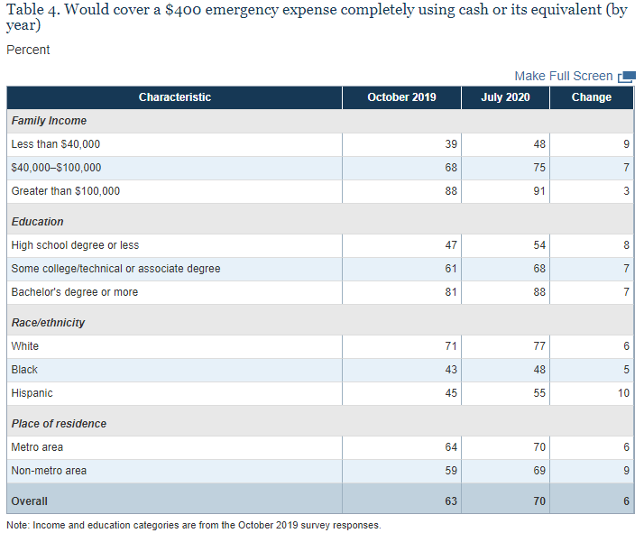
The Fed also provides this table showing breakdowns by income, educational attainment, race, and urban status. The numbers show the percentages of each subgroup who were among the 70% [in July] who would use cash to pay a $400 emergency expense:
No one needs me to point out that (1) unsurprisingly, substantial gaps exist across income, educational, and racial categories; and (2) surprisingly, the improvements from Oct '19 to July '20 were across the board and concentrated in some of the demographic groups that we have heard, elsewhere, are struggling the most. It's also the case that the Oct '19 data represent improvements on the Oct '18 data that generated my two FB Notes linked above.
What else can I say except that looking at this actual data greatly deepens and complicates the satisfyingly simple stories we are fed by our informational overlords. Myself, I would never have known this sort of thing except that I went looking for it on my own for the sake of preparing this newsletter. The Fed assures us that they were compiling new data in Q4 2020. I'll be awaiting the next Report on the Economic Well-Being of U.S. Households, and I'll be sure to relay that to you whether it is in May '21 or sooner.