

A Deeper Dive Than Usual Into (Un)Employment Data
A Deeper Dive Than Usual Into (Un)Employment Data
…Which tells a story more nuanced than what you have heard

As is the case in every week containing the first Friday of the month, the big economic news this week was the release of (un)employment data by the Department of Labor's Bureau of Labor Statistics (BLS). The headlines were easy to write, and came out very uniformly:
Here is the report's prime data table, generating the following big block of commentary.
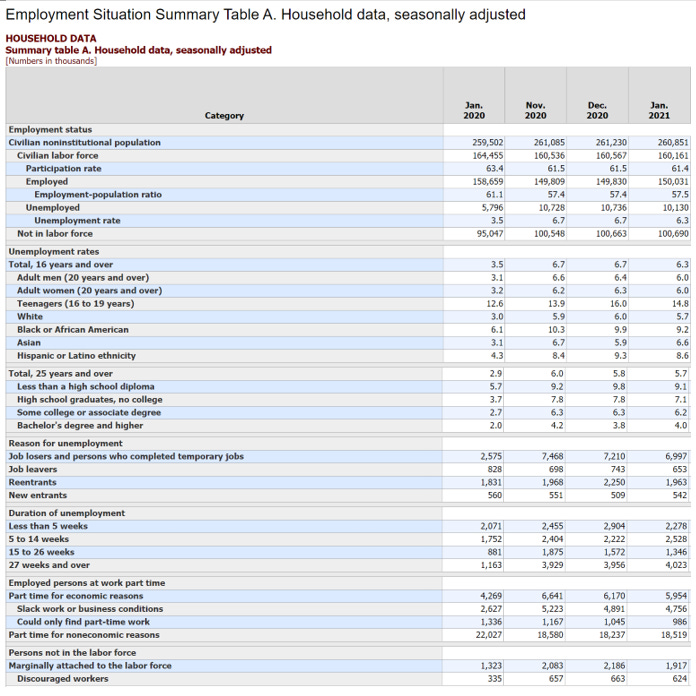
Regrettably, this table only shows us the most recent 3 months plus the one-year-ago Jan 2020. Those columns have their uses, but they also obscure large parts of what was going on last year. The choice to show so few columns\months is not mine; the BLS press release, from which the table is a screenshot, is not interactive. If you want to poke around https://fred.stlouisfed.org/, you can find data and produce graphs for any set of months stretching back decades, but I'm just not going to spend that much of my Sunday doing that.
In particular, what is missing from the table is the story of how Jan 2021 compares to 5 months ago, or 7 months ago, let alone from the bottom of the hole in 9 months ago. We don't get to see here the massive recovery that brought the overall unemployment rate down from 14.8% in April to 6.7% in Nov.
From this table I have unlearned some non-facts that I thought I knew through previous scattershot attention to the news media. Maybe you, too, thought these italicized statements were true:
This pandemic recession is much worse for women than for men. I've listened to long stories to this effect on NPR several times, including in very recent days. But no, the gendered unemployment rates are exactly the same, as it was (within a tenth of a percent) before the recession. When the rates were recently different, it was men who had higher unemployment than women. Previous recessions have usually been more "men hardest hit" phenomena than this one, but that doesn't make this one a case of "women hardest hit." [It's been at least five months since I've heard anyone remind me that the pandemic itself kills men at about +50% above the rate that it kills women. Is that still true, or did it go away, or is it just something we've collectively decided not to talk about, or is it something that our informational overlords have decided we shouldn't talk about?]
This pandemic recession has had a major disparate impact on non-whites. Whites and the continentally broad group known as 'Asians' have a higher economic status than other groups, to be sure, but the evidence here does not give a lot of support to this thesis about the recession. When slicing the population into smaller groups, it becomes less useful to look at the monthly data, which are subject to huge and meaningless month-to-month sampling errors for small groups. To do so could lead to pointless conclusions like these: "African Americans and teenagers captured the bulk of the benefit from the 4-tick drop in unemployment in January." "Hispanics re-entered a deep jobs recession in December and mostly snapped out of it by January." Instead, for these demographic breakdowns, it's most meaningful to just use 12-month changes, thus smoothing out such cases of random noise in the one-month data. Doing so leads to this:
teen +2.2 (up 17%)
white +2.7 (up 90%, almost double; Jan-Dec was double)
black +3.1 (up 50%)
Asian +3.4 (up 110%, more than double)
Hispanic +4.3 (up 100%, double)
Looked at in these two ways, all 'demos' have participated in the recession by magnitudes that are in the same ballpark; none was exempt. Black unemployment rose about as much as the other groups—a little more than whites' but less than others'—and because it started at a higher level, the percentage rise has been only about half of the doubling seen by other groups.
One further way to break it down is to compare by subtraction the highest and lowest ethnic/racial unemployment rates in each January. In both cases that is the black and white groups. Pre-recession Jan 2020, the gap was 3.1 percentage points. Presently Jan 2021, the gap is 3.5 percentage points. Contributing to inequality, yes, but probably by less than you thought, if you're hearing the same broadcast news that I am.
The unemployment rate has been falling only because of the technical (and not good news) reason that people are leaving the labor force. This is another favorite theme of NPR's coverage, but it's not true of the April-present period. Some of the month-to-month changes inside this interval can be construed that way, but see above about 'meaningless' and 'pointless' 'random noise' in monthly stats.
I poked around the BLS website and found the numbers:
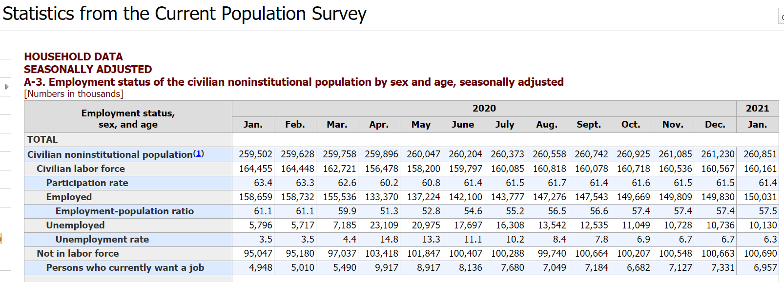
It shows in three different rows—"Civilian labor force," "Participation rate," and "Not in labor force"—that from April to present not much has changed in these inter-related measures.
First, a bunch of teach-y background I've never yet given in these newsletters going back to September. The unemployment rate is a fraction whose numerator is the number counted as "unemployed" and whose denominator is the "labor force," which in turn is the number of employed + unemployed. Those two quantities, you can see, come to only about 160 million out of the population of 330-some million. 23% of the population are children under 18; those under 16 are not even eligible to be part of the labor force by definition. Many millions (of various ages) are retired and not in the labor force. Others are institutionalized, are independently wealthy, or are non-labor-force spouses, often as caretakers of children and others. Those groups make up the vast majority of the almost exactly 100 million "Not in labor force."
But there are others who are Not in the labor force "for economic reasons." The BLS devotes a lot of attention to counting and sub-categorizing these people. The kind we most often hear about and that I always taught about in high-school classes are the "discouraged workers," who are so hopelessly unemployed that they have given up searching for a job. Since the main criterion for being counted as unemployed is to be actively searching, those discouraged, hopelessly unemployed people are not counted as such. (See on today's top graph, bottom line, that discouraged workers are now 624,000 / 160,161,000 = 0.39% of the labor force and less than 0.2% of the total population.) There are other sub-categories of Not in the labor force that are pretty hard to tell apart from the discouraged and each other—both for us trying to understand it and for the government trying to count them.
The main idea, before it slips entirely away, is this: The labor force shrunk and the numbers of discouraged workers and 'Not in labor force' surged in April and somewhat in March, but since then there as been no noticeable trend in any of these numbers. The drop in unemployment since, say, May's 13.3% has been achieved without the "help" of a bump in the number of people dropping out of the labor force. I'm betting you've heard that's what's been going on, but it's not. The increase in employment and the decrease in unemployment since spring are both real.
But I've almost buried the lead. See the gray row called "Employed" that is present in both of the tables above? That's a measure of jobs and job growth that does not generate headlines, but it shows a gain of 201,000 net jobs in January on top of other gains in each of the preceding 8 months back to April's low. We saw at the top that the uniform headlines from Friday always used the number 49K and never 201K.
Here's another teach-y explanation of what is going on with the 49K v. 201K. The Bureau of Labor Statistics conducts 2 surveys every month. The one that generates the unemployment rate and both tables above is the Current Population Survey, or the "household survey," in which they reach a sampling of people at home and ask them a series of questions about their (un)employment status.
Most people have never been part of any national poll or survey, but my number came up and I was part of this survey in Jan-Apr 2003 and again the same months a year later. A woman contracted by the Department of Labor called from a nearby suburb one Tuesday a month while I was watching the 2nd and 3rd seasons of American Idol, the ones with Clay & Rueben, and then Fantasia Barrino (and Jennifer Hudson in 7th place). She asked my age, whether I was working, how many hours, similar questions about the rest of my household, and such. That's the survey that says Jan saw +201,000 net new jobs, an acceleration from the gains in each of Dec, Nov, and Oct.
Simultaneously, the same agency conducts another survey called Current Employment Statistics, or the "payroll survey," in which they call the HR departments at a sampling of firms around the country. They ask How many people work there? How many full time and part time? Is that more or less than a month ago? and similar questions. This is the one that yields only +49,000 net new jobs in Jan.
Then the BLS publishes the results of both surveys on the same day in a single press release. Although both surveys have a line for total employment throughout the country, the one from the payroll survey gets all the press. As much as I know about this stuff—from my first career as a macroeconomist and from all the attention I've paid to such matters ever since—I just don't know why journalists and most economists prefer the payroll survey to the household survey for a jobs growth headline. The household employment number is good enough to be part of the calculation of the unemployment rate, but not for headlining consideration in its own right. What gives? They must have their technical reasons, but I wonder if in current circumstances it might be time for a re-evaluation.
Think about it. During the convulsion of COVID, many firms closed. New firms are starting all the time. Which ones are on the BLS's list of numbers to call for the payroll survey? Not the brand new ones, so those newly created jobs can't and don't get counted, at least not until the surveyors have time to notice the existence of these firms and add a sampling of them to the do-call list. In the household survey, those jobs do get counted, because the counting is done by calling the people who may or may not be working and asking them about that. New employees can be found in the household survey; there is no way for new employers to be picked up in a payroll survey. (Each of them is based on samples, selected as well as the BLS can do, each with their own inherent sampling errors; they are not comprehensive counts of every job across the fruited plain.)
And there is a huge amount of churn in the entrepreneurial sector, as I have noted a few times before. It was just Saturday that I heard on a local radio station that the number of new LLCs (limited liability corporations, which are super-easy for even the simplest start-ups to organize) in maybe Massachusetts or maybe it was all of New England in 2020 was 10% higher than in 2019. When they mentioned the actual numbers, my cerebro-puter noticed it was > 10%. The example they gave was of a man in Fitchburg MA who had opened a Salvadoran restaurant, starting from the solid-sounding premise that with so many closed restaurants and with vaccines flooding the area by April, there will be massive demand for restaurants in late spring, summer, and beyond for anyone who is in business by then. He has very likely never studied Joseph Schumpeter, but he knows all about the creative part of Creative Destruction.
Every headline you see about job growth comes from the payroll survey, which—it seems to me—sets a lower bound on the truth. The household survey adds to that number the start-ups that the payroll surveyors have no chance of surveying, like the Salvadoran restaurant guy and all of his employees. So it shouldn't come as a surprise that the 201K v. 49K disparity we saw for January is not unusual. You can see the full 2020 data for the household survey in the table above. Looking at the same for the payroll survey, I calculate that the cumulative 9-month number of net new jobs coming off of the April catastrophe lows was +16,661K for the former and +12,470K for the latter. That's 4,191,000 more people telling the BLS that they are employed than the number of Apr-Jan recovery jobs found by the other BLS survey.
In recent years there is actually a third important survey of jobs, and it comes out the same week as the BLS numbers. Here's how I described, in one of my first NO-BAH-DI-NOZ newsletters (Oct 4), the data dump…
from the payroll processing firm ADP, which many will recognize as the firm who handles payroll for your own employers. Because they work with so many employers, they have thorough, accurate, and current data on the number of people employed in the organizations they serve. They have a team of economists and statisticians who figure out how to extrapolate from their data to what is going on at all the other employers in the country. The team also takes pains to seasonally adjust the data. The point is to smooth out the predictable, recurring, and therefore meaningless cycles in employment throughout each year. The fact that ADP processes nearly 20% of the nation's private payrolls gives them a massive sample size literally orders of magnitude higher than the one behind the other major employment data dump from the Bureau of Labor Statistics.
One distinction between ADP and BLS is that the former does not attempt to model government jobs, so their numbers is only for the private sector. BLS does it all, and after subtracting the public sector, last month's payroll survey showed only 6000 net new jobs.
That was only two days after the ADP report that showed an entirely different story:
Private companies added 174,000 jobs in January, vs 50,000 estimate, ADP says
So, overall for January, last week gave us 3 estimates of net new jobs: 49,000 or 201,000 from BLS or 174,000 from ADP. They fall in a wide range, but on average not bad. The stock market, a forward-looking leading indicator, did not take it as bad news—indeed, the S&P500 rose all five days last week. [I've been typing my thoughts about Gamestop, Reddit, and all that, but I'll hold them for a separate newsletter, either next weekend or sooner.
During a slow spot in the second half of the Super Bowl, I turned away to C-Span to see footage of a White House event on one of these recent days in which the President cited Friday's jobs numbers. He specifically cited the mere 6000 net new jobs in the private sector from the BLS payroll survey, and said that at that rate it would take 10 years to regain full employment. He's wrong about the math in this sense: 6000 jobs/month would never reach full employment because that's below the rate of growth in the labor force. But his main point was that the economy is very weak and desperately in need of the latest $1.9 trillion spending package—that we need all of the full $1.9tr to rescue the failing economy, was his point.
Earlier in the week it had seemed that he might follow through with his inaugural talk of bipartisanship and unity by conspiring with a set of 10 specific Republican senators to pass a smaller, more targeted bill that would include the most helpful spending but strip out the tax cuts for the people earning in the top half of the income distribution, the foreign aid elements, the payoffs to specific constituencies, and the parts that have nothing in particular to do with COVID. I thought that would be both good policy and good politics for his side. It would cleave the Republican caucus into a 40-10 split, with the 10 joining his Democrats in a 60-40 supermajority ruling coalition that might go on to pass any number of other measures in full accordance with the Senate's rules. I mean his 60-member coalition would not have to play the 'reconciliation' rule-bending game or kill off the filibuster tradition. We could actually pass good, reasonable, moderate legislation, and do it the old-fashioned way. But Biden has decided to go the all-out strictly partisan 50+1 - to - 50 route, casting all Republicans as implacable, irreconcilable enemies.
He could have, it seems to me, opened up something like a civil war within the Republican Party, but chose to intensify our something-like-civil-war within the country, instead. And he used his willful misreading of the jobs numbers—focusing on the 6000 rather than the 49K or the 174K or the 201K or any other available indicator—to justify his decision. It seems like dangerous policy and politics to me, but what do I know.